I have been watching a lot of YouTube videos lately, in particular Jess Karp. She is an amazing artist but also an amazing person. If I had this life to do all over again, I would hope to be like her. She is an example of what a person can do if they have loving support to pursue the things they love and the resources to do it. If you watch her videos you will eventually learn her background and that she started at a young age and had access to art schools. Sometimes the places you live also have an impact on how you develop.
With the digital world today that might not be such an issue as it was for those of us that didn’t have access to the schools or exceptional teachers. I would never have known of my artistic abilities if it hadn’t been for my art teacher I had starting in 8th grade. Even so, with such a late start and the negative experiences I had growing up, I had no faith in my abilities even when I saw them make themselves known on the paper or materials in my hands.
These past couple of weeks, I have begun to see the skills I am learning. In a desire to honor our loving cat, Mimzy, I decided to make her a major portion of two paintings in my art journals. The first is the one with me and my daughter and our dog. She was declining rather quickly at this point having been diagnosed with kidney disease and having entered stage 4 most recently. Having our pets larger than life in the painting signifies their importance in our lives.
The second painting is the one with her sitting upon a book with her favorite objects. Her depiction in this painting looks so much like her, I am so glad I was able to bring her to life in this painting. We had to make a difficult decision and on April 12th, she crossed over after having struggled for several days, no longer eating and only drinking. Her last day she spent some time in the sunshine outside with us keeping her company. Then we took her to our Vet and said our good-byes. She is greatly missed.
The last image is the final result of one I shared earlier which I had been in the process of working on.
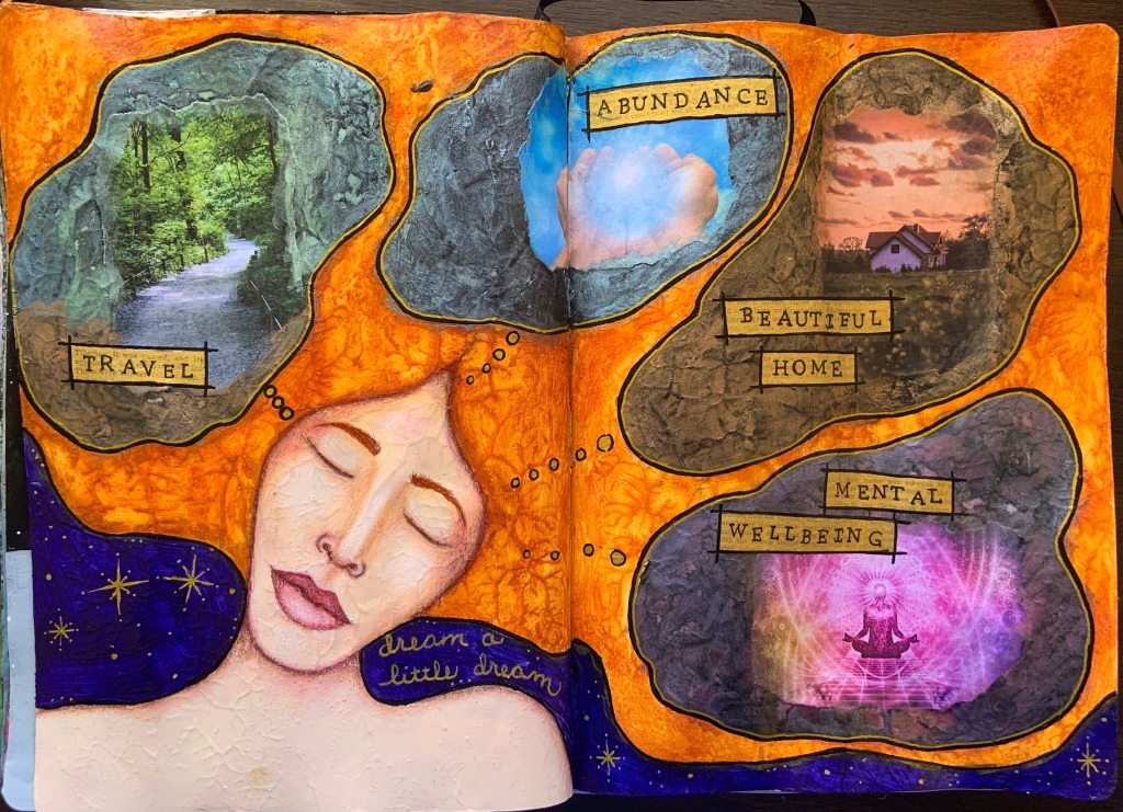
The first image is a self portrait of a spread from a class Effy Wild gave in her Book of Days Fall 2023 lessons, about recognizing those things we are proud of. The spread is meant for journaling these thoughts as if speaking them aloud. It isn’t about being arrogant or bragging but about self-recognition. Many of us do not acknowledge the things we do when we should so we can see we are much better than the person we think we are.
The middle image is expressing our dreams. There was a time when I gave up all hope and I had no more dreams that I could imagine to shoot for or strive for. That was in a very difficult part of my life where I could see no way out. I trudged along day after day. I couldn’t give up because I had my daughter to take care of. It took a few years but slowly things started to change, until I finally could see a tiny light at the end of that long dark tunnel.
I still have moments where I wonder if it is worth having any dreams at all because often the dreams I have never come about, something else always happens and is rarely anything close to any dreams I have. It is still this way, even though my life is gaining a bit of sunshine.
So, this spread about dreams was difficult to consider or even find any dreams that I would consider possible. I did finally come up with four, only time will tell if they are possible. They are more like wishes than dreams.
I have one class left in Effy’s Book of Days Fall 2023 course. This one is also one that isn’t all that easy. It is about recognizing the person I am who does the hard things in life and who I think she is. I have faced some very difficult things in my life, ones I would rather not think about at times but I should acknowledge that I survived. I got through them. I would like to think I am stronger for them but in one particular situation, I discovered my limits and how weak I can be. The hard part is knowing that part of me still exists and it could happen again in other situations. What do I do if it does? That is the scary part because I really don’t know.
These past couple of weeks have been hard on me and my daughter. The loss of our beloved cat, Mimzy has been difficult. We both show it in different ways while the underlying lack of motivation, feeling the need to sleep at odd hours of the day, and feeling her loss unexpectedly at times hits us like a ton of bricks.
I am slowly getting back on track, making lists to keep track so I don’t get lost in all the things I want to do and have something drop without realizing it. Watching Jess Karp has been inspiring, helpful and just a joy to watch. I just hope a small piece of what I watch her do, rubs off on me. If you haven’t seen her, look her up.
I had about an hour to kill so I decided to visit the local thrift shop. I wasn’t looking for anything in particular, just curious what they might have. It had been a while since I had frequented the shop so there were a lot of changes since I had been there last. They had opened a second floor for the furniture and they had moved the book section. It looked like they did this to make more room for clothing.
I like to purchase old books for using in collage but I still had several at home so I didn’t really need any old books. Since I love books, I decided to browse what they had anyway. I thought maybe I could find some sheet music or possibly music books as I am also learning to play the piano. I didn’t find the latter but I did find something interesting.
While browsing I saw a rather large book, an atlas. At first I just passed it by but then I found myself returning to it. I pulled it off the shelf and found it was in amazing condition. Not only that but the pages are amazingly thick. This book measures 12.5″ x 19″ and comes in its own hard sleeve cover. It is dated 1970. I purchased it for only CA$2.50.
This book is amazing as the maps are so detailed. One map is of the US depicting the Civil War and the locations of battles showing where the Union and Confederate armies were. The map is covered in tiny print, red for confederacy and blue for union. That is only one example of the amazing things the maps reveal.
The day prior to finding this, I had viewed a video on YouTube showing how to make pocket notebooks by Four Keys Book Arts. The bookmaker used pages from an old atlas for the covers. Do you see where I am going with this? When I saw the atlas I couldn’t pass it up. I do enjoy making handmade journals, and I am looking forward to seeing how I can use this atlas in my journals.
In regards to drawing, I decided to go back to the basics and practice shading. I watched another YouTube video titled “My Favorite Shading Exercises for Beginners” by Erika Lancaster. I followed her instructions on the 6 exercises and here they are:
I need to learn how to not get graphite smeared all over my pages. lol I use fixative the page is done but until that happens it is so easy for me to get graphite everywhere.
I am not sure if it is the pencils or the paper but in drawing these pages my pencils have felt scratchy. I am probably spoiled by Prismacolor pencils but we’ll see as I try out different graphite pencils to see if they all have the same feel. The scratchiness makes me think the graphite isn’t laying down smoothly.
I have several other things in progress. One of them another journal spread. This one is completely my own though it was inspired by Effy’s Book of Days Fall 2023 Week 10 Now You Can Let Go lesson. I am not sure if I am done yet but I like how it is turning out. The pillars are meant to provide areas to journal about the week.
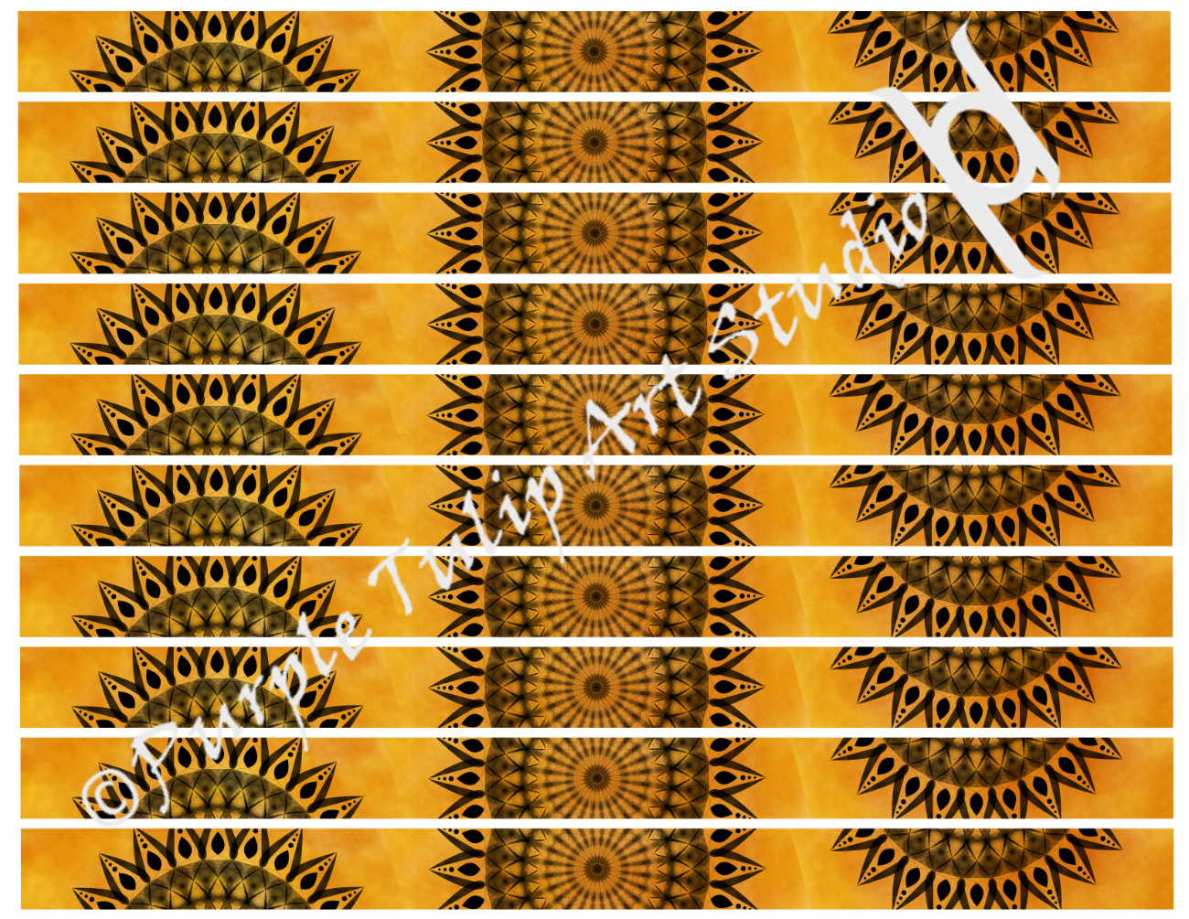
In other areas, I am slowly adding items to my Ko-fi store. I enjoy making digital decorative papers that can be used in a variety of ways. This is an example of one. It could be printed on a variety of papers, including sticker paper. In some cases, I have printed up sheets like this on sticker paper and cut them into strips to use like washi tape. Clear sticker paper would make it somewhat transparent, matte sticker paper would make it very similar to washi tape. Tissue paper or very thin paper would make it excellent collage paper for mixed media. Cardstock could make it excellent for scrapbooking. Visit my shop if you would like to see more designs. More will be added every couple of days.
Book of Days is about art journaling about your life. It can be in the form of daily, weekly, monthly or any period of time you want. I have been doing daily in a weekly spread. I like this approach because it forces me into thinking about my day. It also makes me want to record the most significant part of my day.
I tend to think on the negative side of things. It isn’t that bad because it does prepare me for things that can happen and do happen that are not always positive. However, knowing I will most likely be posting and writing about my journal spreads makes me want to lean more towards the positive aspects of my life. This is good.
This is very good, because it wasn’t too long ago when I discovered I am most likely what they call “negativity bias”. Doing things that make me look at the more positive things in my life is a good thing and hopefully this will help me in the future to remember the positive things more so than the negative things.
This week’s spread is inspired by Effy Wild’s BOD Fall 2023 “From the Vault #3” lesson in which she was dealing with anxiety and the things she will do that can help her during those anxious times. Getting into the “Zen” zone can be very helpful and she uses doodling to help her enter a Zen state.
I am not a natural doodler. I never doodled as a child. I am not sure why. I sometimes wonder if I had a negative experience relating to doodling. I used to watch a woman I worked with during our meetings sit and doodle as she listened to what was being said. She would make some very pretty doodles and I often wished I could do something similar but for me to doodle, I have to breech some walls and my inner negativity critic. I could often hear that doodling serves no purpose. It doesn’t create a beautiful piece of realistic artwork, nothing useful, or anything someone would purchase or hang on a wall. My inner critic thinks nothing is good unless is looks realistic. But then my inner critic wasn’t a connoisseur of some of the master artists like Salvador Dali.
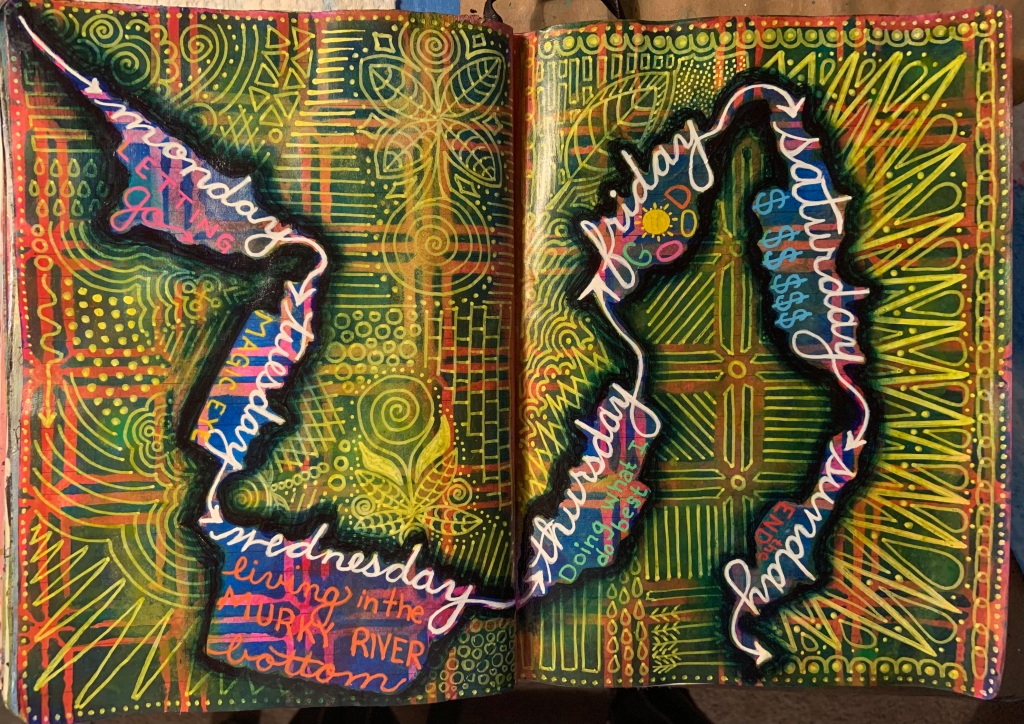
The below two images are two points in my journey with this week’s art journal spread. I have taken up the doodling challenge to see what I can create, but my logical mind wanted an area to write a few words about my day and didn’t want to have to contend with doodles getting in the way and not leaving any room for the words. I devised a plan to create a trail of the days of the week, and next to each day of the week, either above or below the word, I will write a few words about the day, then doodle around it.
The second image shows my progress so far up to Wednesday (today). I did the majority of the doodles seen on the page, today after I selected the phrase representing today. Thursday will be a busy day for me so I may not doodle until Saturday or Sunday.
I enjoyed this today more than I thought I would. I like the path created by the days of the week. My logical mind finds joy in this as it shows a logical progression of my week. The background was done using a homemade stencil. I am not great at stenciling. I invariably end up with too much paint on my sponge causing it to leak under the areas that aren’t supposed to have paint. I plan on getting a stencil brush soon but for this spread, the messiness works well with it.
I have the worst luck when it comes to white Posca Acrylic Paint Pens. I don’t know what it is with me and white pens but they often stop working on me before the paint runs out. It is very frustrating. Getting the white doodles down that I did today was a feat in itself. I may resort to keeping the pens that no longer work and just using them to dip into white acrylic paint like a dip pen and draw or write with them. It is bad enough I have to fight my inner critic and even worse to have to fight with my art supplies.
I tried three times to create the Life Book 2024 “Whispers of Gratitude” lesson painting to get a similar feel of simple elegance of botanicals. This is my third attempt and the closest I was able to get. I needed to move on to the other lessons but this helped me to understand what I need to do to create the effect I want. After creating this, I came across a YouTube video that showed something similar in which they explained to use colors in the same color family, for instance, greens and blues as I did here but they did not vary size or the leaf shape very much, just slight changes in the colors. I may try this again in the future but for now I need to move on to the other lessons.
The next lesson in Life Book 2024 is about self-affirmation, self-love. Tamara Laporte demonstrated how to make some affirmation cards. On days where I feel off, things like this can be a reminder to be gentle and kind to one’s self and pulling a card with something positive and self-affirming can help switch one’s focus. Tam made only nine cards. In my usual fashion, I decided to make more.
The below image was taken after I completed one card. See that stack on the left of the six cards? Yes, that is my goal to fill every one of them with self-affirmation, so I can use them like a Tarot deck or Spirit deck, as one would use them to remind themselves to open up and look at what is around us.
I didn’t follow Tam’s process exactly. Because I wanted to make plenty of cards, I decorated the pages in a similar fashion up until I was ready to start adding a focal image or the words. At that point is when I cut the pages into 3×4″ cards. After I add the image and the words, I round the corners, and ink the edges. I may put a glossy or matte finish on the cards once they are all done.
I am not sure if I will do glossy. Glossy can tend to be tacky and cause the cards to stick together. I have had journal pages stick together and a few years ago I made a regular playing card deck with a glossy finish. After a while of being stacked together some will stick together. No damage when I pull them apart but the risk is there. I had even waxed them but it could just be the brand of glossy medium I used. I’ll make that decision after I finish all 63 cards.
The affirmation cards will take a while to complete. I expect I will be needing to print many of the images I will want to use. I had to purchase a new printer. My old Brother printer was starting to wear out. I had some lines that weren’t printing at all, and it was leaving black streaks across my papers depending on what paper I used and what I printed. I went through almost a whole set of ink cartridges sending the printer through its cleaning process and printing the test pages. I finally gave it up.
I have always wanted a wide format printer and scanner and I found an Epson model that was on sale. On top of the Staples took my old printer and took another $50 off the new printer. It took no time to setup and my first test print was awesome. It definitely is an improvement on print quality. I can’t wait to test out the wide format just haven’t had time or a reason to do so. I expect my card deck will give me that reason.
In even more art news, I signed up for a free class “Wish Upon a Star”. The below image is the warmup bonus lesson of creating a Magical Eye. I am thrilled with how this came out. It isn’t as mystical looking as the instructor’s but then this is more me than the mystical version.
After I finished this I came across another YouTube video that demonstrated how to draw a realistic eye. When I have the time, I plan on giving this a try. My dream is to be able to draw realistically and this eye gives me hope in being able to do that. I have had much trouble in the past drawing eyelashes. I am getting closer to it and the video on drawing a realistic eye breaks it down even better.
If you think this is a lot going on in a week, along with me working full time. You are right. But…. it isn’t all that I have been doing. I pulled out a sketchbook. This sketchbook at first was to return to my anatomy class and continue my 100 days of drawing bones which was pushed to the side recently but instead of putting myself into a box of having to draw one particular subject, I am leaving it open. I started over at #1 and each drawing will be numbered as I go. I am not pressuring myself into drawing every day because I have a lot of drawing activity already with my art journal and lessons. And somewhere in my day, I do need to work at my day job. lol
On top of that, I am continuing to fill in any gaps with creating digital designs to put up in Redbubble or Ko-fi.com. I have some designs I created some time ago and it is my goal to tweak them and make them available on Ko-fi.com. The great thing about digital designs, you can use them as often as you like. They will never run out as long as you have a printer, paper and ink.
If you are interested in seeing what I have in my shops, check these out:
I started writing this a few days ago and became sidetracked as life has a way of doing this. So forgive me please the lateness of this post.
Today (24March2024) marks the last day of this journal spread. If you missed my first post on creating this spread, you will find it here. This past week has been a flurry of activity in many areas, so for this spread I picked just four days to write about using some succinct wording. This is about midpoint before I started filling in the blocked off sections.
I learned a lot from working on this spread.
The colors are scrumptious. They make me very happy. It is like surrounding my brain with a warm blanket whenever I look at this.
Each day I chose a tangle pattern to use in the blocked areas and I chose words or a phrase to represent that day.
Monday was a day of sunshine, it was the last of several we had in a row so I couldn’t let that go unnoticed since I love the feel of sunshine on my body.
Tuesday was an off day for me and I couldn’t seem to wrap my head around anything so I let it go. It wasn’t that it didn’t exist. It just didn’t have anything I wanted to make note of.
Wednesday was a continuation of Tuesday, where it felt like everything I did went wrong but in the end, it all ended up right. I have a feeling people will understand what I mean, even without the details.
Thursday was a day of rain, as had been Wednesday but Wednesday’s rain wasn’t that noticeable with all that went on.
Friday I ended up watching a three hour video of “Unbelievable Celebrity Impressions On Got Talent” on YouTube. It had me laughing out loud several times and it was even funnier when many of them did impressions of Simon and sometimes taking risks in doing so. It showed Simon’s good nature even though he can be tough on those who go in unprepared. Three hours seemed to be a lot and I didn’t think I would watch it all but in the end I’m glad I did as the laughter felt wonderful.
After adding all the details of tangles, and the words, I wasn’t completely happy with the spread. I considered leaving it as it was but the light blue borders bothered me.
I didn’t settle for the light blue borders on the right page. It just didn’t fit and stood out like a sore thumb so I worked on changing that. It took a few tries. I started with Phthalo Blue but it didn’t fit in either. I tried layering on gold but that didn’t work. Since these pages had purple, I mixed magenta and phthalo blue and ended up with the color I wanted.
As I layered on the purple, then added a layer of gold. The layer of gold ended up lifting the purple in a couple of places, because of it not being completely dry, to reveal blue. This was okay because this brought a bit of variation into the borders so it blended better with the rest of the spread, so I purposefully went back and removed a bit in other sections. Sometimes my impatience in letting things dries benefits me, other times not so much. Thankfully, this time it did.
Adding the dark purple caused the blocked areas to recede so I tried first outlining one in gold pen but that didn’t help. Then I tried outlining one in black pen but that didn’t do any better. I finally picked up the white which did the trick. Then I wrote the days of the week each area represented.
Below is the completed spread.
When creating the tangle patterns I was using Tombow Fudenosuke Brush Pen. I have a soft tip and a hard tip. I ran into a few problems where the ink seemed to fade on the page in some areas while in other areas it didn’t. It also seemed to rub off easily, sometimes even the next day. I did my best to not touch it or apply any wet medium over it and started using a piece of paper or paper towel between my hand and the page. I am learning this is a good practice no matter what medium you are using to protect other areas of my work.
Yesterday when adding the dark purple around the borders on the right page, I couldn’t help but paint over the days of the week I had written above each section. I noticed the ink didn’t move at all. Didn’t even budge. It was late Friday night when I had completed the last section and late Saturday evening when I added the purple around the borders. My only conclusion is that the Tombow Fudenosuke has a cure time even though it states it is a water-based pigment ink. This is confusing because I would think water-based would make me think it would move whenever something wet touched it but that didn’t happen. Maybe it becomes permanent once it is completely dry/cured. I do not use heat on any of my artwork to make it dry faster so I know heat did not set it.
I did a bit of research and found on Tombow’s website under FAQs a comment under the Mono Drawing Pens:
Are MONO Drawing Pens water soluble?
No, the MONO Drawing Pens are not water soluble. They have water-based pigment ink that is permanent and water resistant.
According to this water-based pigment ink is permanent and water resistant, so very confusing in my mind. lol But this is good news. It means I can continue to use the Fudenosuke Brush Pens in my artwork, but I do know I need to be careful and let them dry completely.
In researching this I came across the MONO Drawing Pens by Tombow and now I want to try them. My biggest problem with these types of pens, like Sukura Pigma Micron pens is I end up destroying the nibs. I can be rather heavy handed when writing. I am hoping this is changing due to my use of brush markers and learning to draw and write very thin lines. If I am not light handed with the brush markers then thin lines are impossible.
Back to my art journal. What is happening in this journal is amazing. The collection I am creating is beautiful and shows a history of my life these past few months as I have progressed in my art. Over the past few spreads, I am learning to be better at my color choices so my pages are cohesive and complementary.
My journey continues… see you next time…and thanks for reading.
Several years ago, I began creating some designs and then I was sidetracked by life. It happens. I knew they existed but in a way I had forgotten about them until recent activities brought me across the various things I had designed.
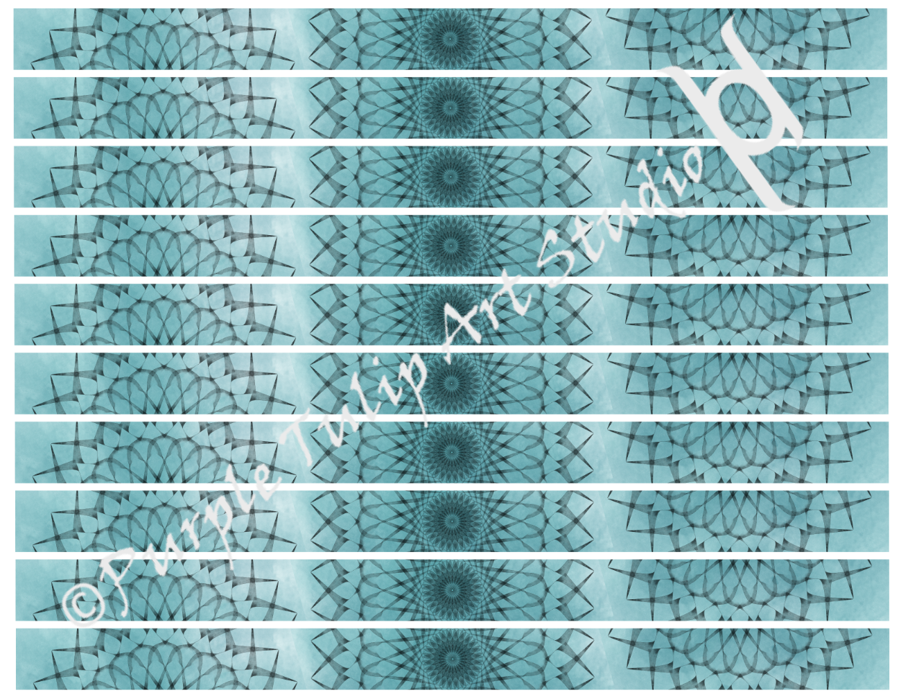
Below is an example of washi tape I was working on. I designed them in 1/4″, 1/2″ and 3/4″ widths. At the time I often used them in my journals to help add some color and life to the pages that were filled with my writing.
These can be printed on 8.5″ x 11″ paper in landscape. The paper can be any kind that you like, anywhere from plain printer paper, to cardstock, to transparencies and sticker paper, matte or glossy or clear. If it can go through your printer then it can be used to print these designs.
Oh, I almost forgot. I print them sometimes on tissue paper, by taping the tissue paper to printer paper and sending it through my printer. The tissue paper can then be used for collage. If it is white tissue paper then the white will disappear into the background becoming almost transparent when using a glue medium like matte medium and the design will be visible sometimes a bit transparent. I love this effect which is why I sometimes use napkins after removing the couple of layers from the back and collage with just the layer that has the design.
These were created from a full mandala design and as I have time the washi tape designs along with the full design will be posted in my Ko-fi.com shop: https://ko-fi.com/purpletulip
For now these are being posted as “FREE” with “Pay what you want”. If you do not have the funds, now worries. I am just happy if people enjoy my designs.
I don’t just enjoy creating art, digital or traditional art, I enjoy using my own art in creating other art. I also enjoy it when others find a use for what I make as well. In today’s world with AI making it so easy for people to have a software program to create art, though flawed as it is right now, it is my hope that people will come to appreciate something that is hand made whether it is in using traditional supplies or in using a digital graphics software. Both of these require skill and a lot of time to learn.
When I look out at this world through the window of my home and see so many examples where it took someone with skill to design everything I see that is manmade, I am more aware than ever how AI could replace this aspect of human creation even though it takes a human to tell it what they want, it doesn’t take the skill of a painter or an architect to describe what they want to an AI.
Like the stores are doing today, bringing in self-checkout machines, I see the commercial art world bringing in AI. Both of these situations eliminates a lot of jobs but more than that, they eliminate a human interaction and creativity.
I remember the first time I walked up to an automated teller machine (ATM) and it spoke to me, a female voice with an English accent. I cringed. I have been around computers since 1978, operating them, then programming them and managing databases. At no point did they ever speak to me until that day and I did not like it. I prefer human interaction whenever possible. Short of that, then written words. I guess I’m old fashioned that way, but also a geek in appreciating what a computer can do for us.
Whenever you can, if you feel the same as I do, or even if all you do is appreciate the human element behind the artwork you see, or the stories you read, whenever possible, PLEASE express your appreciation to the person behind the artwork and stories. Though most of us will still do what we do without that appreciation because of how it makes our soul feel, it is knowing that others appreciate what we do that makes us want to put what we create out in the world for others to enjoy.
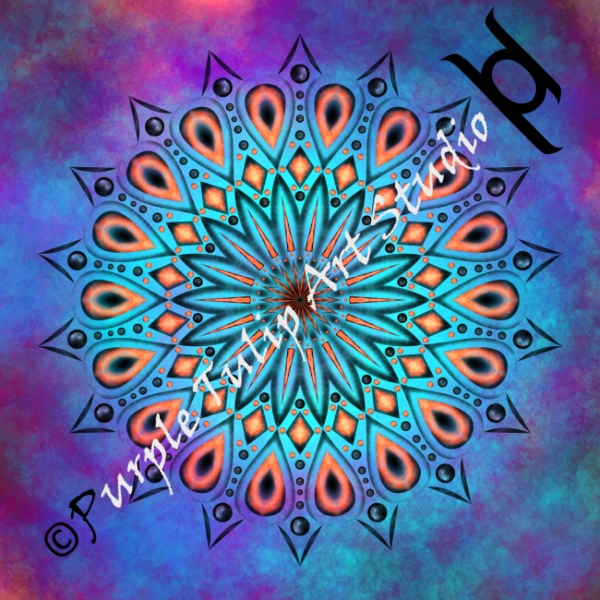
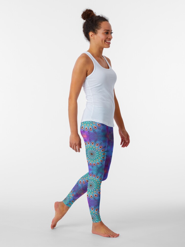
I came across a digital mandala design I created and decided it would be a good design for selling on products on Redbubble. This is the design on leggings. I just might buy them for myself and my daughter too.
This is a lesson about gratitude and finding ways to create a piece of art based off of what you are grateful for. Tamara Laporte is a great instructor and is kind and caring to everyone. I will display my work as I progress on this piece but for the instructions consider looking into Life Book 2024 at Willowing.org.
This work is being done in watercolor which at times has been a struggle for me to face my inner critic. Watercolor is known to be an art medium that can be quite difficult to master. What I am learning is to be patient, kind and methodical in my approach.
Sometimes the make of watercolor can be the culprit that causes frustration. Using cheap children’s watercolors can be more frustrating than a higher priced tool for learning. I purchased a set of student grade watercolors and though the colors are not as vibrant, it does allow me to learn how watercolor will react on various substrates. For instance, when using paper that Stalogy contains in its journals is far different than printer paper, sketch paper, mixed media paper or watercolor paper. Even watercolor paper has various paper types, like 100% cotton versus the cold pressed watercolor paper in a Strathmore Visual Journal, so don’t expect watercolor to respond the same way on various types of paper. It will also respond differently on dry paper versus paper that has been made wet in preparation of the wet-on-wet watercolor technique.
All of these things can create a lot of frustration for someone who is learning to paint with watercolor. Following an instructor can make the process a bit easier but can leave you frustrated when you try to branch out on your own.
The best way for me to learn is to continue following classes while also practicing on my own. Practicing and taking notes about what I learn can help cement the information into my memory so the next time I paint with watercolors some of it might stick.
When trying to paint with the cheap watercolors, what also happens is the poor pigment quality can prevent some things that the watercolors with a better quality of pigment do. For instance, leaving a layer of watercolor dry before adding another color can create a layer of depth. But when using cheap watercolors this can be a problem. The poor pigment might not stain the paper as well, and may reactivate leaving none of the color left without mixing with the new layer. This might happen no matter how long the first layer has been drying. A better quality watercolor will stain the paper while drying, meaning the pigment seeps into the paper. Some of it might move when adding another wet layer but a portion of it should remain deep in the paper providing a layering effect.
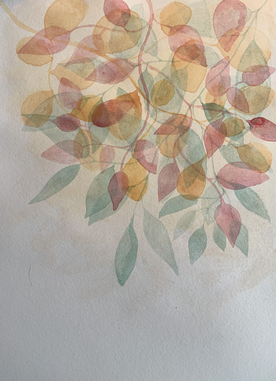
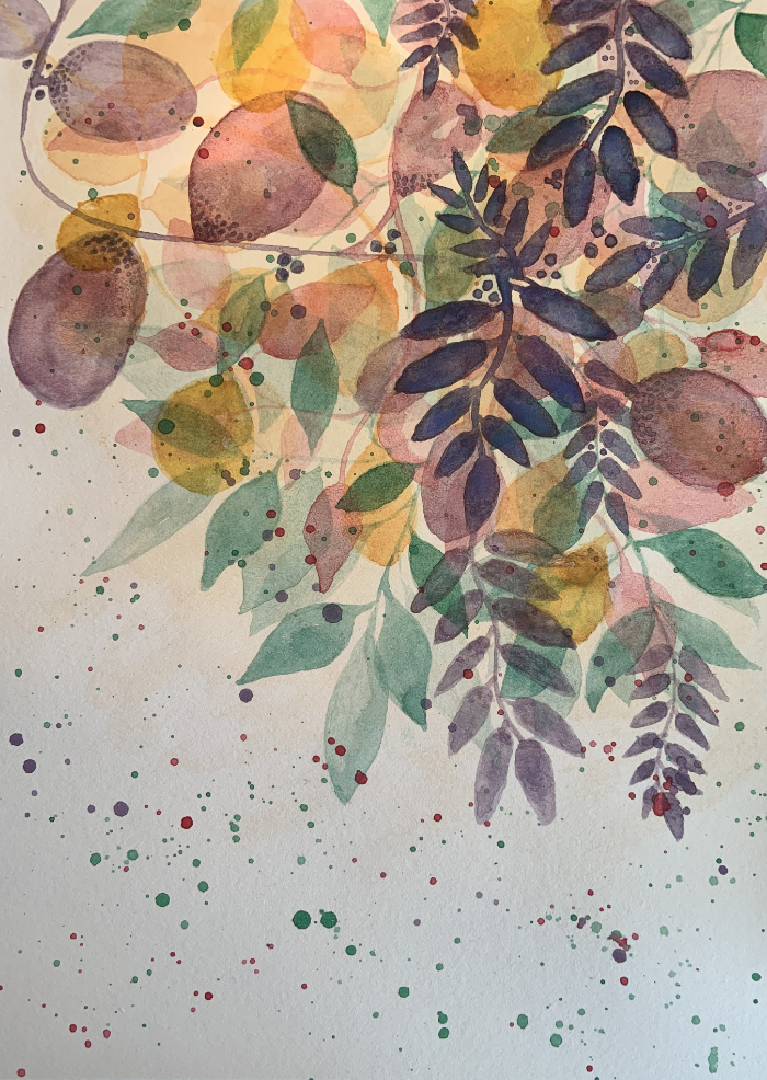
This is my practice page. Looking at the top where the reddish leaf overlaps the small orange leaves, the orange leaves below it practically disintegrated when I put down the red leaf. Most likely due to me not waiting long enough between the layers. Looking at the purple leaves you can see how they layered better. I waited longer before adding the purple layer.
I learned a lot from doing this practice page. I hesitate on doing such practices on good watercolor paper because I don’t want to waste good paper. On this one I am glad I did because if I want to learn and become good, I need to practice. I can continue to practice on this page from what I learned and see what else I might learn to add to my notes.
What you use for your practice depends upon what you want to learn. In this case, I wanted to learn how to layer watercolor effectively. If all I wanted to do was learn how to paint the shapes of the leaves and petals, I could have done that on cheap paper, like printer paper.
Using watercolor paper, even good watercolor paper paper and paint isn’t a waste if you want to learn how the paint will react on different paper or with other colors or brands of watercolor. This will ultimately lead you to improving your skills as a watercolorist.
I will be adding a gallery of images below with the progression of my layering. This is about using layering to build depth and to use contrast to create a focal point or to guide the eye across the canvas.
In the first image, there is a very light background layer, with two layers of leaves or petals. The second has a third layer of petals, and the third has a fourth layer of petals. The rest of the images will progress with layers increasing in pigment until the last layer.
I am hoping I am not layering too much or too many colors because it is already beginning to look very busy. Hopefully, the darker pigments on the next few layers will help resolve this.
I think the red violet layer I put down was too dark, too soon, hopefully this will merge in as I add darker layers.
The darker green leaves are helping so I’ll see how the next layers go. I think it is better to continue to see if I am able to pull it together, than to stop. Sometimes stopping can mean missing out on seeing it come together.
I need to remind myself that the paints I am using are student grade and are not as vibrant. This may work better with a higher quality watercolor. Or just leaving out the red violet. My color range might be too wide. Adding the green might be throwing it off.
What am I learning?
I liked the green in my practice page.
I like the sparseness of the practice page.
Less is more in this case. (Don’t over populate the first layers.)
Maybe make a sketch to get an idea of the top most layer, with a few underlying layers.
The below group of images take you the rest of the way to the final piece.
Added darker green leaves.
Added darker purple leaves to create a focal point.
Added splatters and some texture to some of the leaves.
Started adding some black outline to the purple leaves.
Continued with the black outline and added some purple outline to the lighter of the purple leaves and rotated image.
Removed the tape I had bordering the edges of the paper and flipped it back around.
I kind of like the image flipped like it appears in the fifth image. I like the outlines on the darkest purple leaves. I think it helps define them more. I do think this is too cluttered but for my first attempt, it isn’t bad. I will most likely recreate this at another time as I did enjoy the process.
I lied. I wasn’t done. I added a few more outlines and some texture in a few more petals. I am liking this though I know it could be better, maybe a bit less busy but I think the darker focal point and the addition of outlines and textures has helped.
I don’t understand the difference in the background where it was darker in the earlier images when my lighting was the same. The change occurred when I did the splatters which now make the background lighter and the very soft wash in the background is now appearing in the images however very lightly. I think the splatters helped somehow with showing the true color of the paper.
This is my first post writing about a project I am working on. The idea is not mine. This comes from Effy Wild’s “Book of Days Fall 2023 Week 9 – The Little Things”. I have been following Effy for many years, took some classes several years ago before life caused a detour. This isn’t my first in this group of classes. But it is my first since deciding to return to this blog and write about my art.
What I took from Effy’s class was to do an abstract spread, breaking the right page into quadrants and the left page to be the main focal page. The words “An Ode To The Little Things” is all Effy’s and the idea to write them in block letters as you will see later.
I will take you through my process but it won’t be step-by-step from the class. I detoured from the class a bit and I would not infringe on Effy’s lesson. She is a wonderful artist and teacher so if you want to learn more about her process, please look her up. She uses art as a tool for healing which I am only beginning to get a slight understanding of how it works.
The book I am using is not an art journal. It is a regular writing journal with lined paper meant for writing in like a diary. It is not meant for liquid media except maybe ballpoint pen. To give the page some additional strength to handle the mediums I will throw at it, I glue two pages together. Sometimes, I prepare them by using white gesso. In this case, I did use white gesso spreading it with a palette knife leaving some texture on the page.
I used washi tape on the right page, around the edge and to cross over in the middle, to create four quadrants of equal size.
Once it was dry, I journaled with water soluble markers on the left page. It is not meant to be seen and I used white gesso over it, activating the marker so it mixed in with the gesso. It created a light blue tint to both pages as I treated both pages to keep them cohesive. I let this dry. As it was drying I realized I forgot to place washi tape across the center of the page vertically. I added it at this point but knew this would leave the center vertical stripes above and below the horizontal stripe a light blue. I would figure out how to fix this later.
This is where my process completely veered off from Effy’s. I am not comfortable with abstract art. I have done a few pieces but until I learn how to mix paint properly and choose colors that work well together, this will be an uncomfortable zone for me. The biggest challenge for me is getting the colors right.
I chose 5 of my favorite colors (Purple, Turquoise, Deep blue, Magenta, and Bright Yellow). I have been learning a bit about color theory and I knew enough to know that using yellow could destroy the whole background if not done right. I start with three of the my chosen colors (Purple, Turquoise and Deep blue). I knew they would combine well together when there was any overlap. I put the paint down in patches on both pages and before it was totally dry, I dripped water and spritzed water over the paint, then used a paper towel to blot the water up. This created patches of lighter color as you can see in the below image.
In the next image you can see the blue stripe from my mistake earlier.
After the first colors dried, I then added the second set of colors (Magenta and Bright Yellow). I needed to do this so the yellow would not cause a mud when going over the purple so I was careful in its placement. I then spritzed the pages again and blotted again. Once that layer was dry, I added gold and silver paint in patches on both pages. This is what is causing the glare. It is next to impossible to get metallic paint to show properly in pictures. Especially for an amateur like me.
I made sure all layers were dry and added the block lettering to the left page. I outlined it first in black, added a purple metallic marker for the thicker border around the letters then added a white outline. I liked how this set off the letters making it easy to read. I removed the washi tape and knew I needed to fix my mistake.
To fix it I added washi tape again but on the edges of the quadrants where they were painted. Then I painted the white borders to match the light blue. You will see this in a later picture.
Here are close up images of the four quadrants. I love how different they are and the paint textures that are showing up.
For my version of abstract, I decided to add tangle patterns. I have not done tangle patterns in years and have been feeling a need to include them in my journal. I started first by adding gold dots in the purple border around the letters. The last image shows the correction to my earlier mistake. I am also adding a bit more color using paint pens, so far to create dots in various places hoping to set off the tangle patterns.
I find the tangle patterns I want to use on TanglePatterns.com.
I am still in the process of adding more tangles. They will be added as the week progresses throughout the week. I will return and add more images once the spread is completed, probably around Friday.
I absolutely loved how the background turned out. I meant to take a picture of the left page before I put down the lettering but I forgot. The four quadrants will suffice if I ever want to use them for collage. I have added them to my Ko-fi page in case anyone wants a copy of the the high res images, they can be found here.
My world and life has changed drastically since 2020. I will give a brief history which may or may not give insight into why I have chosen the path I am taking.
For most of my adult life I worked in IT. It was the main staple of income for me and my daughter. It was a good income, one I thought I would have until I retired and have the many options someone in such a position would have for retirement, like pensions, 401K and their investments.
Along came 2016. The company called it ‘forced retirement’ since I had just reached retirement age. I had committed my life to a career in IT, an area of it that was becoming more and more specialized and colleges/universities were no longer including this specialization in their curriculum. Essentially, I was laid off. I had a 15 year old daughter at home. I had sole custody and no child support coming in.
Because of the specialization in my career field there were only a couple large corporations I could be hired into that would require no additional training or next to no time to educate myself to do the job required. However, both of these corporations went through layoffs quite frequently and one of them was the one I had just been let go of.
Unprepared and the only one earning an income, now no longer having any steady income at all, put me into a deep state of depression, anxiety and a quiet mental breakdown.
I had to do something and being on medication wasn’t the answer. I also lost any hope I had for a future that was financially stable when after almost a year and a half went by and the only offer of a job was a minimum wage part-time job, working twenty hours a week. Not enough to sustain anyone, let alone a mother with a teenage daughter.
On top of this, the workplace environment in these types of places was toxic, beyond toxic. They let managers belittle their employees no matter how old they were and how hard they worked. They let co-workers gang up and complain about other workers that were unjustified complaints. They changed rules on the fly to suit their own benefit so those rules were not in place to be fair, they were there only to give preferential treatment to others.
I will admit, I sought any form of distraction I could. The most beneficial was my journey into learning how to draw again. I had not drawn anything of significance since high school. This is critical because I didn’t know I could draw until I was in eighth grade. I went from drawing stick figures, tracing images from books, to drawing a colt from a picture I got from a library book in my new school when my new art teacher’s first lesson was to pick out something we loved and draw it. I am a literal person so when he said “draw it”, I knew he did not mean “trace it”. And so I sat down and started drawing something as close to real life as I could. What developed was a surprise to me.
I had entered that art class in the middle of the school year, having moved from the school I had been attending where art was not part of my curriculum in eighth grade. As I worked on the drawing in the class, the art teacher came up to me and asked how I learned to do what I was doing, which was using a tissue, my finger, an eraser, and any tool I could get my hands on to help me create my drawing. I looked up at him and I said, “No where, I just tried it.” He said nothing and walked away. He was my art teacher all the way through twelfth grade. Each year, he chose some of my art to keep after asking me if he could.
There are only a few significant memories I have from 8th to 12th grade and most of them involved art. In 8th grade, besides that first realization I had that I really could draw, our teacher held a contest. The local bird dog club asked him if there was a way a sign could be created for their club. I don’t know how it was all worked out other than, our teacher gave us some rules to the contest:
A bird dog had to be an image on the design.
The colors of the club were blue and green.
The name of the club would be part of the design.
I don’t remember being told that it was a contest as to who would create the sign. Just that there was a contest and the club would be picking the one they liked. I created 4 quadrants on my paper of alternating blue and green, two squares across and two squares down. In the center I drew the head of a bird dog in graphite and glued it down and created the text of the name of the club in an arc over its head.
The judges picked mine. The teacher came to me and said they liked mine so much they wanted to know if I would create the sign. He said all the materials would be supplied for me and the only thing I had to do was take the time to do it. I could work on it after school. Oh and I would not get paid. I walked to and from school and my mother was fine with me staying after school to work on it. They provided wood and my teacher oversaw the work so I would know what materials I needed to use so the sign would last.
There was one change to my design. They wanted the full dog, not the head. I found an image to refer to. I drew the design on the primed wood and started painting. I was almost done when some boys from the school came into the room and started making fun of what I was creating.
They thought it hilarious that I created an anatomically correct male dog.
In their joking and making fun of what I was doing, they ended up knocking the paint over and it went all over the work I had done. The teacher saw what happened. He saw how upset I was and made the boys clean up the mess, but I wouldn’t let them touch the sign. He told me not to worry, repainting it would cover up the mess. I cleaned up the sign and repainted it. I kept it just the way I had designed it, and it went off to the bird dog club. My teacher told me I did a good job.
Underneath that paint, I knew the mess that was there and the repairs I did were not as good as the original. I new the imperfections left from that situation and it isn’t that it bothers me but was a life lesson about boys and being sure my art is protected at all times.
Another project in 8th grade, we were instructed to pair off. We would draw a portrait of our partner. We were given black paper and white chalk. Everyone quickly paired off and because I was new and didn’t know most of the students, I was left and so was another girl that no one wanted to pair with. She had a mass of messy curls, octagon wireframe glasses and was what we called ‘homely’ in appearance. She was not strikingly beautiful like most of the others in my class. We sat opposite of each other and began to draw.
I heard snickers from the other students when they looked at her drawing. I didn’t care. She could draw me anyway she wanted as long as she was happy with what she created. Others looked at me with sympathy because of having to draw her. It didn’t matter. At this time in my life any art I did was a huge challenge and so I met that challenge with hope and determination, but most of all, I faced it with doing the best I could.
Where most everyone else looked at their partners and drew as if they were using graphite on white paper, I looked at my partner and drew the opposite. Where I saw shadows, I also saw highlights and the highlights are what received the white chalk. The shadows received a smudged version of white that gave a shift to not exactly grey but to a subdued white. And her face emerged. Her glasses became a challenge of highlights and black to frame her eyes. Her hair became a mass of scribbled highlights. When I was done, I heard gasps from the other students and they no longer looked at me with sympathy.
I learned about creating caricatures which I am not fond of to this day. lol But if I think about it, I guess a whimsical character could be a caricature of someone if I based it off of a person.
For the next years, I continued to surprise myself and my teacher with my creations. I learned different things like learning to carve a design into a material that could be used for printing. Rolling on ink and pressing it into paper. I had no idea at the time that I was learning how to create a stamp. That isn’t what it was called but it was basically like that but the material was either 4″x4″ or 6″x6″. I struggled with what to design. I often struggle with the design elements for any art creation.
The design that finally popped into my head was to take parts of a bicycle and layer them, over lapping them to create a sort of collage effect of the parts. Deciding what parts would be printed and which parts would not be was not easy. I learned how to create a fine line between the areas crossing over each other to create a separate definition of each part. At the end, my teacher asked to keep it. I always said yes when he asked.
The last thing I remember is a self-portrait project. I don’t remember the assignment other than we had to draw a self-portrait. In the end, these self-portraits were displayed around the school. The difficulty I had was in how to do this at home. The only mirror I had was on a wall in my room which meant I would have to stand during the whole time I was drawing and I had no way of holding my drawing pad. I finally took it off the wall and positioned it on my bed, on my pillow, leaning against my headboard. I sat in front of the mirror and could see my whole body sitting cross-legged. I thought why not? I’ll just draw myself, drawing myself. I had on an old pair of jeans when I got to the legs. I put in such details that you could see the stitching and each wrinkle in the seam. What happens in such cases of drawing, the objects closest to the mirror end up out of proportion with the rest of the body and this happened with my hands. I didn’t mind because for once I was able to draw hands as they looked and with depth and proper shape and shadow.
I had no instruction on anatomy or proper proportion. Everything I drew was from what I saw. As I draw now, I realize just how difficult that assignment was to get things ‘right’ and apparently I did. My teacher also asked to keep it and of course I said yes. This was the highest compliment I could ever have.
Towards the end of high school, I ended up in conversation with him in which he suggested I consider being a commercial artist. I did not follow that path, it would have required either art school or a degree. I did not have the resources to attend college.
Now, so many years later, in 2016, having not lifted a pencil in years, I had started to watch art videos. I envied those who could create beautiful paintings and drawings. I came across a group that did what is called Zentangle. It is a registered trademark, so I cannot claim this as anyone being a Zentangle teacher has to go through their training. I thought about it but I did not have the funds to travel or pay for the class. Minimum, part-time jobs provide very little.
I found a site tanglepatterns.com. This provided the many patterns I could create for my growing obsession with drawing but it wasn’t enough. It however did give me the confidence to go on drawing. I found more videos, some on creating an organic abstract drawing of patterns and designs. They were beautiful but I found it very difficult to create a similar affect.
Then I discovered mandalas. Mandalas turned out to be the key for increasing my confidence and shutting down my inner critic. The mathematical aspect of creating a mandala just lit up my brain and made my logical brain happy and my creative brain ecstatic.
This progressed on and fed into branching out into painting, drawing portraits, and learning whatever I could through videos and art classes I could afford.
I am also learning digital art after finding an affordable graphics software. What I love about tangles is being able to put them into a digital format that can then be used to copy/duplicate to create an abstract pattern.
For instance, these are some of the simple tangle designs I created digitally.
As you can see in the below image, these designs can be added in a number of ways to create some interesting results. This was done quickly just now and I have not added in any shading that could set this off even better. I just wanted to show how they can be combined.
The biggest challenge is in finding the time to do all the ideas I have germinating in my head. I need to practice drawing, painting, designing, and any number of things so I improve.
I also want to find time to write which can be quite time consuming. Just writing this post is taking me hours. But, I am also stopping to create the designs I am portraying here.
TanglePatterns.com has hundreds of patterns to boggle the mind. On top of that I have other projects that have been started or in the design phase. Classes I am taking and working on creating my own version of what the instructor creates.
Then…. I have my work. I am no longer working a minimum wage job. Those minimum wage jobs showed me how much abuse and mistreatment is in the workforce where people are living in substandard conditions and can’t find work that pays enough. The stress there is unbelievable. People need a decent income but they also need to be treated like respectable human beings and given a workplace that is supportive and enjoyable. Why do they think work should be a hateful place to be and as uncomfortable as possible?
Because of this, I have branched out on my own at the recommendation of a friend who needed some technical writing done. I need to decide, do I want to continue this venture? Or do I want to fully retire and pursue my art and writing full time. The latter is my ultimate dream. The former provides a better income. My instincts say to hold off on retiring so I can get the full benefit of a higher pension paid each month. It all very much depends on how working for myself helps with reducing my income tax.
This world is not an easy place to live in. The complications can be mind boggling. I sometimes wish I had followed my art teacher’s advice but to do so would have been far more difficult in the beginning but maybe no so difficult now. I can’t go back and relive it, so I must make the best of what I have now.
I have decided to build an online presence for my art and writing, in a way with the potential to provide for me and for those who find my art enjoyable or may aid them in their own adventures. It will take some time to build. If you want to follow me on my journey, then follow me here and/or on my ko-fi page: https://ko-fi.com/purpletulip
Just a couple of examples. I am not sure how long I will stay on either platform due to the lack of control I have and the cost of the products. I would rather make my art financially available to as many people as possible than just a select few who don’t mind paying the prices.
Art and writing started out as a way to distract me from my real life. Being laid off was the hardest thing I have ever faced. Breast cancer was easier, believe it or not. Both have left lasting results that will be with me until I die. I will never again trust large corporations in regards to job security. I will always be afraid each time I get sick, if cancer has decided to return and take over my body.
With that said, it is time to sign off and dig into my art. Writing sometimes takes me back to not so good memories but it also helps me to release anything I have not let go of yet and art helps me to let go of most of the rest. Why not make it a life long journey to share with others? Over the next few posts I will share what I have completed lately. The pros and cons, the things I’ve learned, and the things that frustrate me. I hope to inspire new artists who don’t think they have it in them to be good or great. My suggestion is to just ‘do’. Each time you ‘do’ offers you a chance to improve and learn.
Hope to hear from you. Hope to see you back here again in the near future. And I hope you find joy, love and laughter in your life.
Much has changed since the last post I wrote. Going forward this blog will be only focused on my artwork and writing. I will be making a new post soon.